Publication Booklet
This project explores the history of typography through a structured, type-led design that balances clarity, consistency, and visual depth.
The Challenge
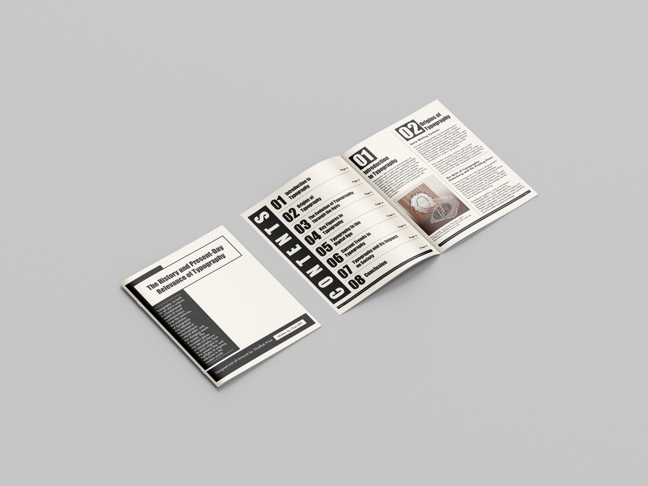
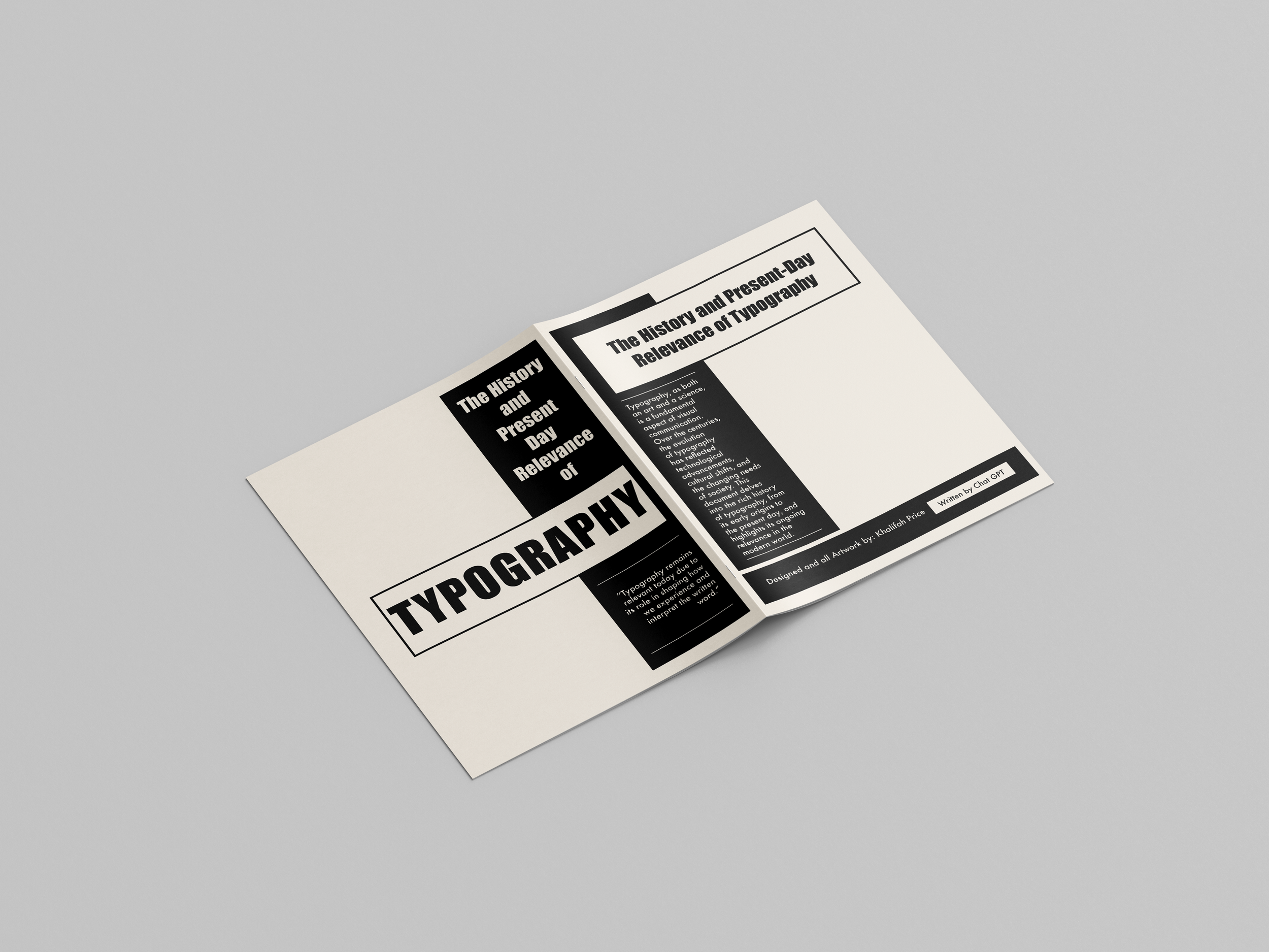
The goal for this project was to design a publication booklet that explores typography and its history, using type as the central design element while fitting a large amount of content into a cohesive layout.
The Concept
I aimed to create a design that feels both simple and complex. It stays structured and clean while presenting the information in a visually rich way. I used a consistent visual system to guide the reader and give the content room to breathe. To support the written material, I included some of my own recent work to show how typography functions in different design contexts.
Process & Execution
I used typographic hierarchy, alignment, and spacing to structure each spread and lead the viewer through the booklet. The layout stays consistent while subtle changes in scale and arrangement keep the reading experience dynamic. Each design choice was made to support the flow of content and maintain clarity. This project shows how typography can carry both the visual identity and the structure of a publication.